
CASE STUDY
One Design System, Two Different Banking Experiences
Exploring how a shared design system can support different banking contexts without sacrificing consistency or flexibility.
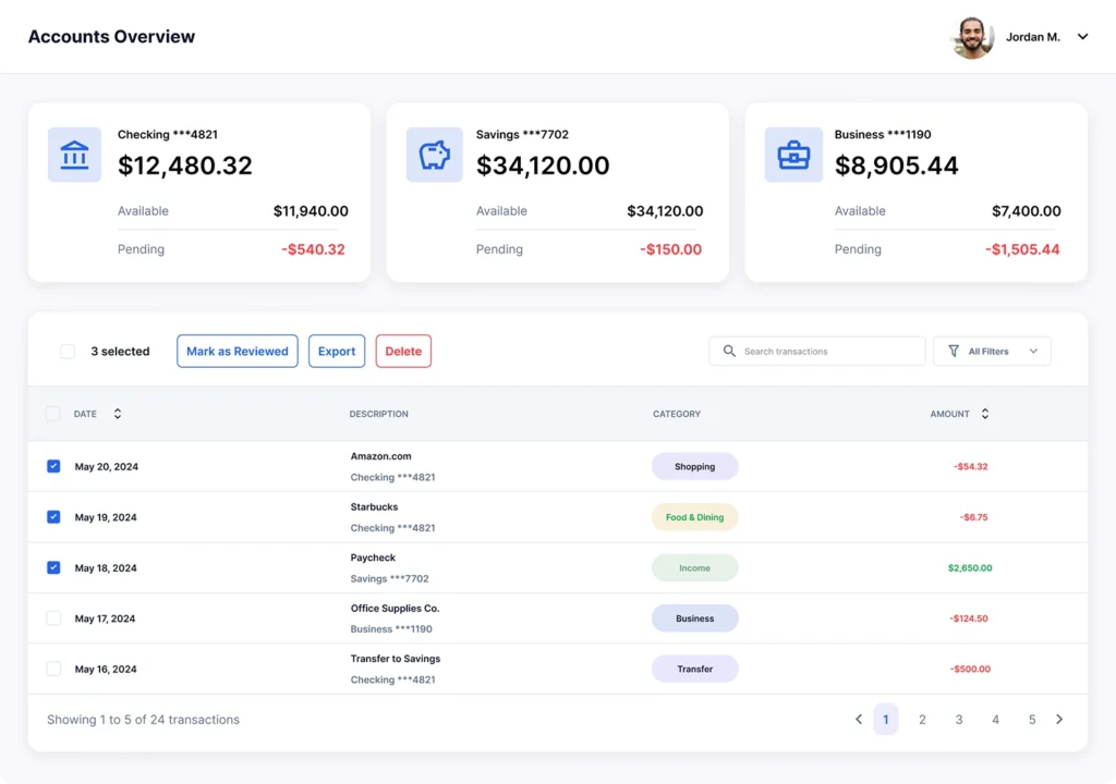
- Role: UI/UX Designer
- Focus: Design Systems · UI Design · Component Architecture
Why This Project
Banking products often need to support different users, workflows, and information priorities.
The challenge is not simply creating two different interfaces. The harder question is deciding what should remain consistent and what should adapt to context.
This project explores how one design system can support different banking experiences without becoming too generic or unnecessarily fragmented.
The Problem
Two banking experiences can have different requirements while still sharing many underlying interaction patterns.
Creating completely separate interfaces may solve individual requirements, but it can also lead to duplicated components, inconsistent patterns, and unnecessary maintenance.
The challenge was:
How might one design system support different banking experiences while preserving both consistency and contextual flexibility?
Why It Matters
A design system should not force every experience to look and behave exactly the same.
However, creating a separate system for every context can introduce unnecessary complexity.
The real tension was between two competing needs:
Consistency
A shared foundation, predictable interactions, and reusable components.
Flexibility
Different information priorities, content density, and contextual requirements.
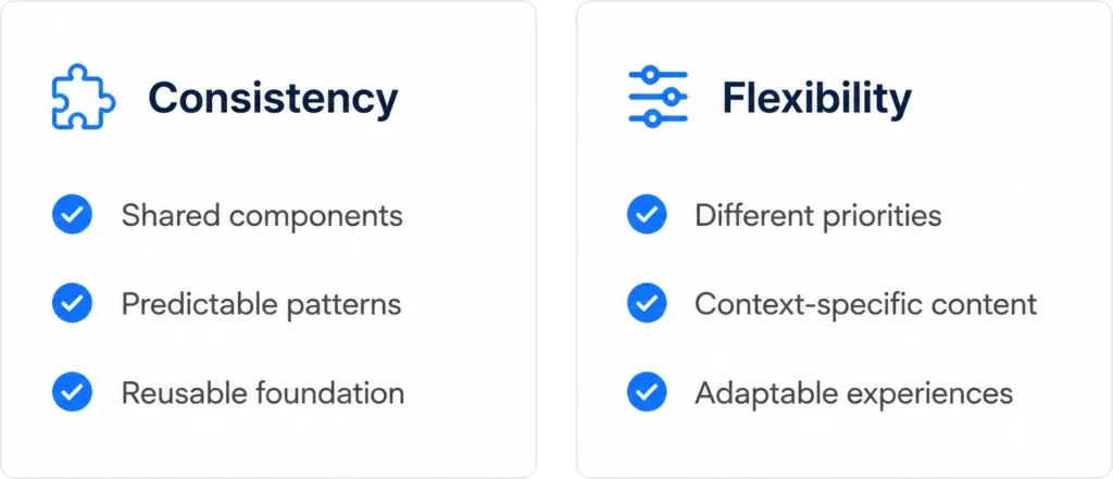
The goal was not to make both experiences identical.
The goal was to find the right level of consistency.
What I Wanted to Discover
Because this was a conceptual design exploration, I did not have access to production users, internal business data, or usability metrics.
Instead, I explored three key questions:
01 — What can genuinely be shared?
Which foundations and interaction patterns should remain consistent across both experiences?
02 — Where does context require flexibility?
Where should information hierarchy, density, content, or actions adapt?
03 — Can one component support both?
Could a shared component foundation handle different requirements through controlled variations instead of duplication?
Shared Foundation
Which foundations and interaction patterns should remain consistent across both experiences?
Contextual Flexibility
Where should information hierarchy, density, content, or actions adapt?
Reusable Components
Could a shared component foundation handle different requirements through controlled variations instead of duplication?
The Key Insight
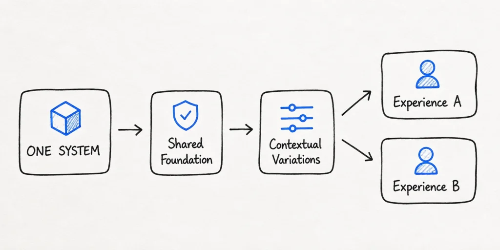
The two experiences did not need two completely separate design systems.
They needed:
The important distinction was not:
“How can both experiences look the same?”
Instead, the better question was:
“What should stay consistent, and what should be allowed to change?”
This became the central principle behind the design direction.
Alternatives I Considered
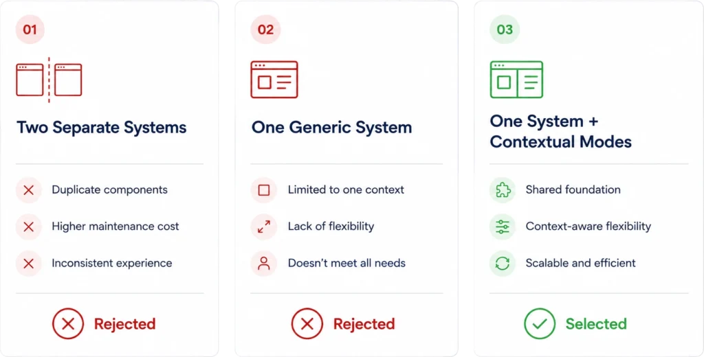
Before choosing the final direction, I considered three possible approaches.
Option 01 — Two Separate Systems
Why I considered it:
Each experience could be independently optimized for its specific requirements.
Why I rejected it:
It would duplicate foundational patterns and increase the risk of inconsistency and maintenance overhead.
Option 02 — One Completely Generic System
Why I considered it:
A single standardized system would maximize consistency.
Why I rejected it:
Over-standardization could force different workflows into the same structure and reduce contextual clarity.
Option 03 — One System With Contextual Modes
Why I selected it:
It preserves a shared foundation while allowing controlled variation where context genuinely requires it.
The Design Decision: One System, Not Two
The final system was structured around three layers.
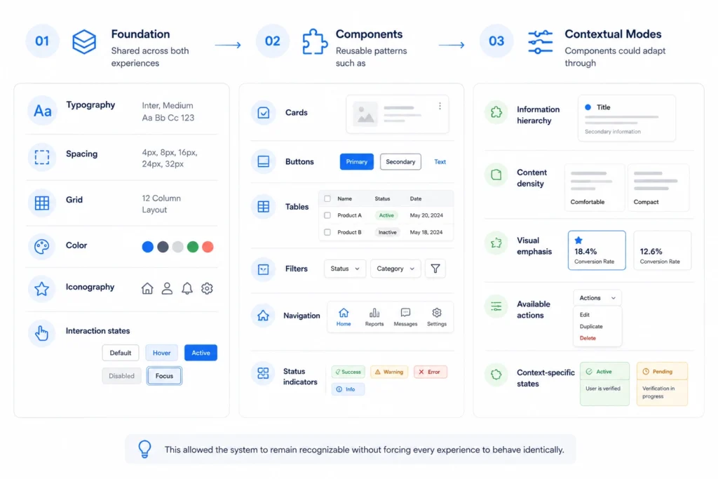
The Proof: Same Component, Different Context
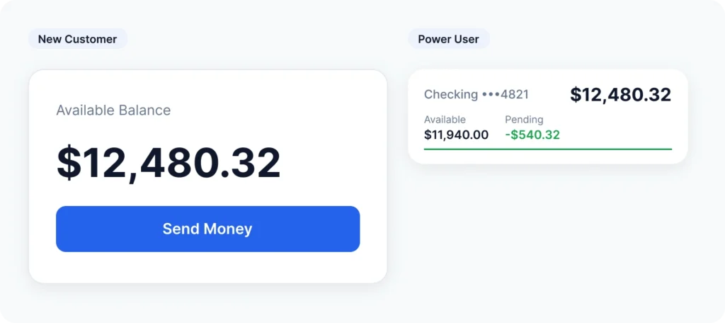
The same component can serve different purposes depending on the context.
The underlying structure remains consistent.
What changes is:
- Information priority
- Supporting content
- Available actions
- Visual emphasis
Consistency in structure does not require identical presentation.
The Proof: Not Just Visual, Functional
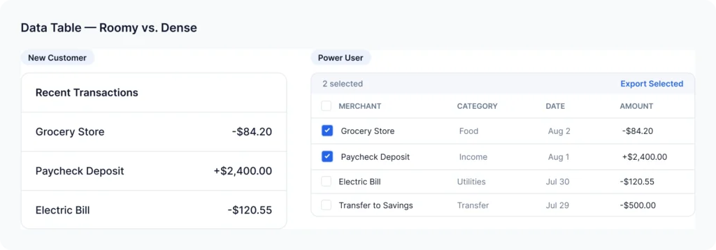
The variation is not only visual.
The same component architecture can adapt to different functional requirements while maintaining a consistent underlying system.
The focus was to avoid creating unnecessary one-off components for every scenario.
Instead, variations were introduced only when the context required them.
The System in a Real Screen
A component system is not useful if it only works in isolated examples.
I applied the same design principles to a complete banking dashboard to test whether the system could scale across a realistic interface.
The shared system was used across:
- Account summaries
- Financial information
- Status indicators
- Actions
- Tables
- Navigation
The objective was to test whether the design-system logic remained consistent at the screen level.
Accessibility Check
Accessibility was considered as part of the system rather than a final visual check.
I reviewed the concept against core accessibility principles, including:
- Readable text hierarchy
- Sufficient contrast
- Clear interactive states
- Understandable status indicators
- Consistent interaction patterns
- Information that does not rely only on color
Designing for the In-Between
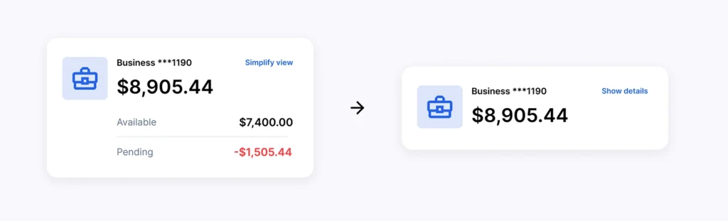
The most interesting challenge was not designing two completely different experiences.
It was designing the space between them.
A shared system needs enough structure to remain predictable, but enough flexibility to accommodate legitimate differences.
This led to a simple principle:
Standardize the foundation. Adapt the experience.
What Changed Because of the Design
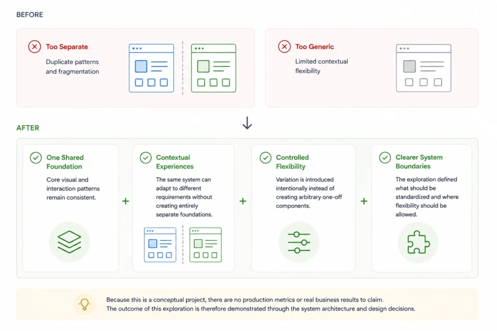
Because this is a conceptual project, there are no production metrics or real business results to claim.
The outcome of this exploration is therefore demonstrated through the system architecture and design decisions.
One Shared Foundation
Core visual and interaction patterns remain consistent.
Contextual Experiences
The same system can adapt to different requirements without creating entirely separate foundations.
Controlled Flexibility
Variation is introduced intentionally instead of creating arbitrary one-off components.
Clearer System Boundaries
The exploration defined what should be standardized and where flexibility should be allowed.
Final Outcome
A shared design system for two distinct banking experiences.
The project resulted in a unified design system that balances consistency with the flexibility required by different banking experiences.
Instead of creating two separate systems or forcing both experiences into a single generic interface, I developed a shared foundation of reusable components, design tokens, and interaction patterns, with room for contextual variation.
Key outcomes
- Shared foundation: Established consistent typography, spacing, color, and component patterns across both experiences.
- Contextual flexibility: Explored how reusable components could adapt to different user needs without fragmenting the design system.
- Scalable structure: Created a foundation that could support future screens and features while maintaining visual and interaction consistency.
What I learned
A scalable design system is not about making every screen look identical. It is about creating consistent rules while allowing the interface to respond to different user needs.
Project status: Concept project. The design system has not been validated in a production environment.