
CASE STUDY
Taskora
Led the end-to-end UI/UX for a SaaS landing page that turns skeptical team leads into free trial sign-ups — from research to a 2.3x lift in conversion.
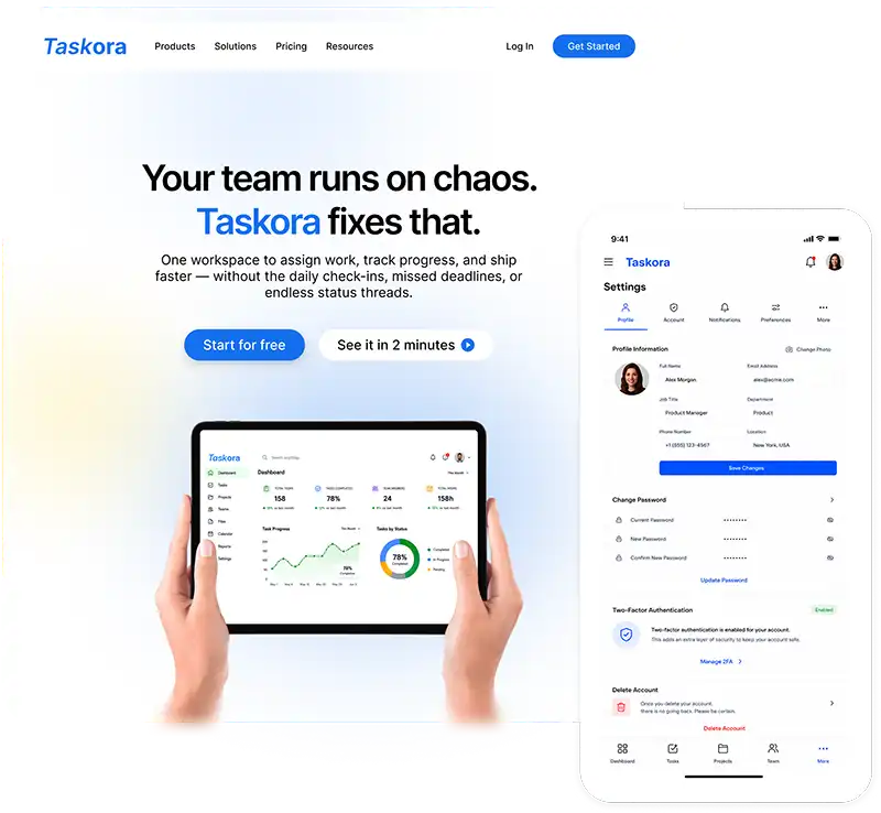
- Role: Lead UI/UX Designer
- Project Type: Product Design • UI/UX • Web & Mobile • SaaS landing Page
Project Overview
Taskora is a team productivity platform that replaces the 4-5 tools most teams juggle daily.
Tasks, docs, chat, timelines, and reporting — all in one place.
I was brought in as the lead UI/UX designer to design the full marketing landing page from scratch. The goal: communicate product value clearly, build trust with first-time visitors, and drive free trial sign-ups across desktop and mobile.
6 wks
Project timeline
3
Pricing tiers
2
Breakpoints
500+
Target team users
The Problem
Taskora solves this — but the design challenge was bigger than the product itself.
How do you convince a skeptical team lead — who has been burned by “all-in-one” tools
before — to give Taskora 30 seconds of their attention on a landing page?
How do you convince a skeptical team lead — who has been burned by “all-in-one” tools
before — to give Taskora 30 seconds of their attention on a landing page?
Business Goals
Primary goal
Drive free trial sign-ups. Remove every barrier between the visitor and the 'Start for free' button.
Secondary goal
Build credibility fast. Position Taskora as enterprise-ready, not just a startup side project.
Audience range
The page needed to work for a solo freelancer and a 50-person enterprise team at the same time.
Trust gap
No brand recognition. Unlike Asana or Monday.com, Taskora had zero prior awareness to lean on.
Research & Discovery
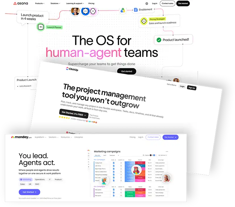
With the problem defined, I studied the competitive landscape before touching any design tool — auditing the landing pages of Asana, ClickUp, Monday.com, Linear, and Notion to evaluate hero structure, feature framing, social proof placement, and mobile experience.
Competitive Analysis
I audited the landing pages of Asana, ClickUp, Monday.com, Linear, and Notion — evaluating hero structure, feature framing, social proof placement, and mobile experience. Key patterns observed:
- Platforms that led with user pain (not product features) had cleaner, more direct copy.
- Trust signals placed above the fold consistently reduced perceived risk for first-time visitors.
- Pricing pages with 3 clearly named tiers outperformed those with complex feature matrices.
- Mobile versions were often afterthoughts — navigation was cluttered and CTAs were hard to reach.
Key Insights
Insight 1: The 8-second rule
Visitors decide whether to scroll within 8 seconds. The hero must answer three things instantly: what is this, who is it for, what do I do next.
Insight 2: Trust before claims
Feature lists feel empty without proof. Brand logos and social proof need to appear before any capability claims to hold attention.
Insight 3: Mobile intent is high
Many first visits come from LinkedIn or ad clicks on mobile. A poor mobile experience directly kills conversion from paid channels.
Insight 4: Pricing friction is real
Users abandon pages when cost is hidden. A visible free tier removes the single biggest hesitation for new sign-ups.
Design Principles
- Clarity over completeness — show what matters most, not everything that exists.
- Earned trust — every claim must be backed by a proof point within the same scroll view.
- Friction audit — question every form field, modal, and required step before adding it.
- Mobile parity — design for the narrowest context first, then expand.
Who Uses Taskora?
I defined three target user types based on the competitive analysis and the product’s stated audience, each with a different mental model and a different question they need answered.
How the Design Evolved
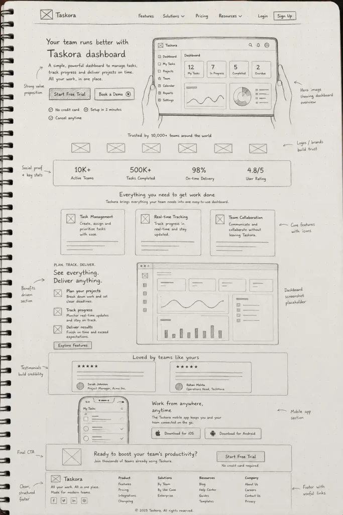
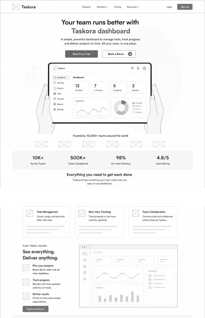
Phase 1 - Wireframes
Low-fidelity structure
Phase 2 - Iteration
Testing assumptions
Reviewed the mid-fidelity mockups against the competitive patterns and design principles established earlier, and revised two areas: the feature section felt too long, and the pricing tiers were hard to compare at a glance. Both were redesigned before moving to high-fidelity.
Phase 3 - High Fidelity
Visual system + responsive build
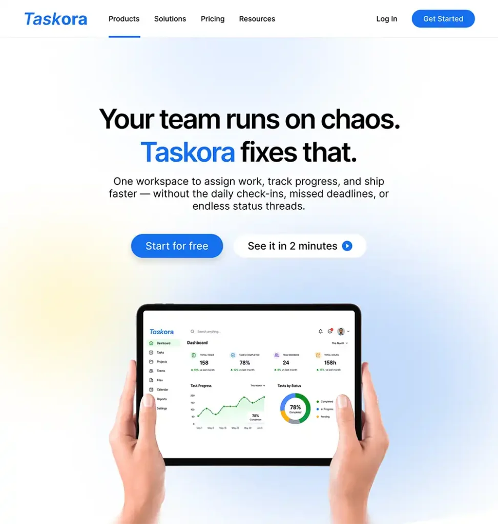
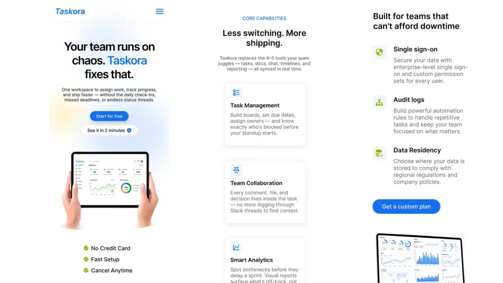
Design System Thinking
Component set
- Button variants: Primary (solid blue), Secondary (outlined), Ghost — all with hover, focus, and disabled states.
- Feature card: Icon + title + body. Used across capabilities, enterprise features, and pricing includes.
- Testimonial card: Avatar + quote + name + role. Constrained to two lines of quote text to prevent layout breaking.
- Pricing tier card: Header, price, feature list, CTA. Highlighted variant for recommended tier.
- Nav bar: Collapses to hamburger at 768px. Sticky on scroll with a subtle shadow on scroll trigger.
Spacing & Typography Scale
Type scale
Spacing system
Final Page Architecture
| Section | Purpose | Answers |
|---|---|---|
| Hero | State the value proposition and prompt action | "What is this?" |
| Social proof | Reduce skepticism before feature claims | "Can I trust this?" |
| Core capabilities | Show what the product actually does | "Will it solve my problem?" |
| Enterprise panel | Qualify larger teams before they contact sales | "Is this built for us?" |
| Testimonials | Validate with real users before the pricing ask | "Does it actually work?" |
| Pricing | Enable self-selection across all three personas | "What will it cost me?" |
| Final CTA | Capture visitors who scrolled all the way but didn’t convert yet | "Why should I start now?" |
Results
A clearer product story and a more structured path to sign-up.
The project resulted in a SaaS landing-page concept designed to communicate the product’s value more clearly, establish trust, and guide prospective users toward the next step.
I organized the page around the questions a potential customer might have: What does the product do? How does it help? Why should I trust it? What should I do next?
Key outcomes
- Clearer value proposition: Prioritized the product’s core benefit instead of relying on generic marketing statements.
- Structured information hierarchy: Organized product benefits, supporting evidence, and calls to action into a more coherent page flow.
- Trust-oriented design: Used product-focused visuals and supporting content to help visitors understand the offering before signing up.
- Defined conversion path: Designed a more direct journey from understanding the product to exploring the sign-up option.
What I learned
A conversion-focused landing page is not simply a collection of persuasive sections. Each section should answer a user question and help the visitor make an informed decision.
Project status: Concept project. The proposed design has not been launched or tested against a live conversion baseline. Conversion improvements remain a hypothesis, not a measured result.